Aptos
Ashfall Studio
29.10.25

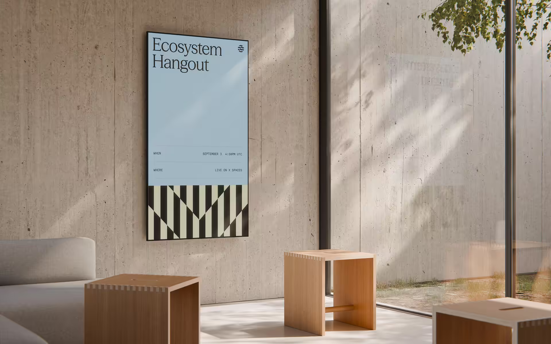
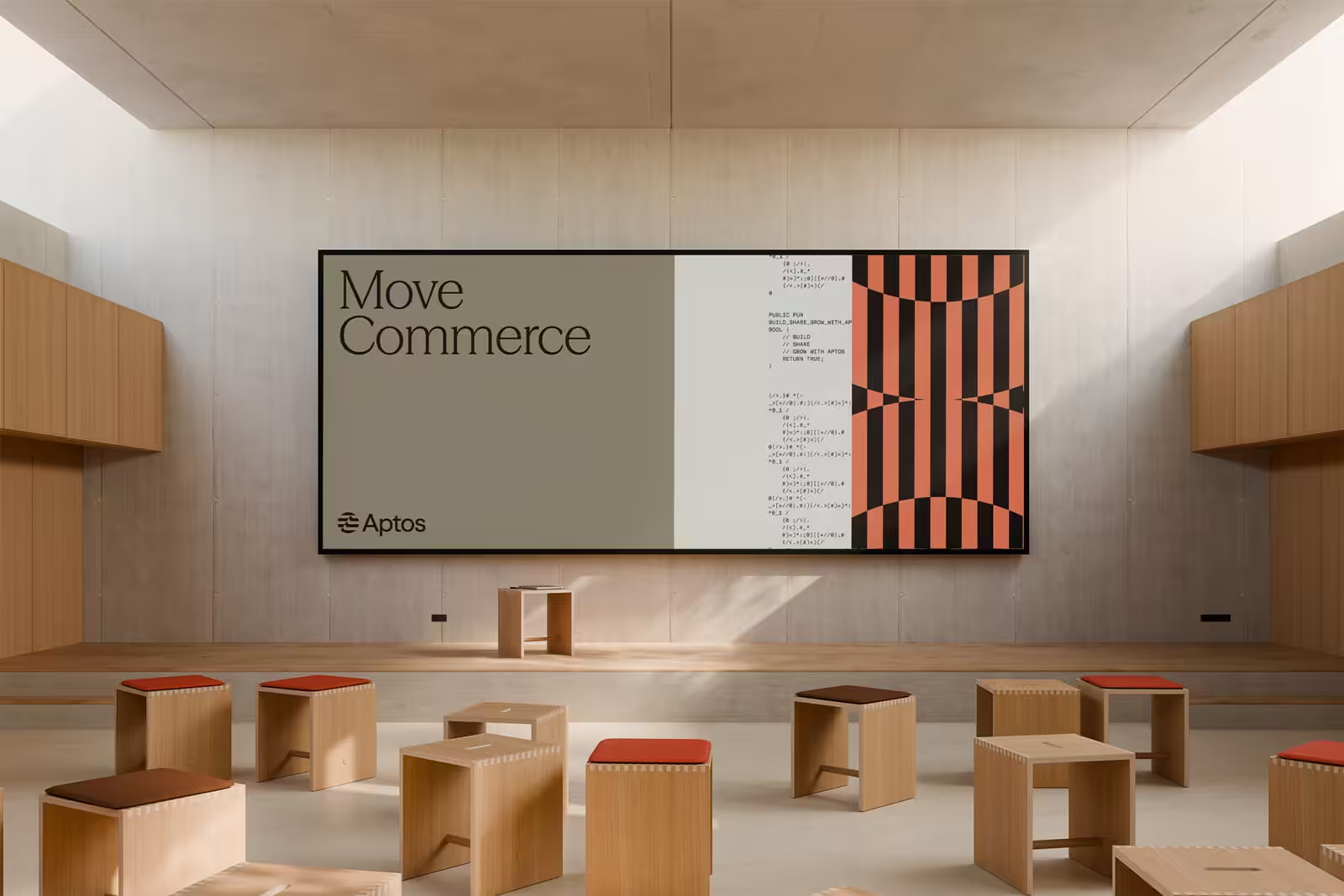
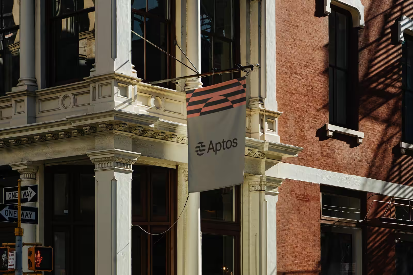
Ashfall Studio reimagined the brand identity for blockchain platform Aptos, breaking away from the typical dark, neon-heavy aesthetics of crypto design. Instead, they focused on a human-centred visual language paired with precise, technical refinement.
At the core of the new identity is the wave symbol redrawn and refined to become a foundational design motif. A modular 16-unit grid system brings consistency and flexibility across all touchpoints, from digital content to large-scale event environments.
The refreshed identity also introduces kinetic typography, motion-responsive imagery, and a custom typeface that fluidly transitions between serif and sans, infusing the brand with movement and adaptability. Rather than relying on futuristic neon hues, the palette leans on warm, light tones to evoke both approachability and sophistication.


