Push
Fontwerk
27.03.24

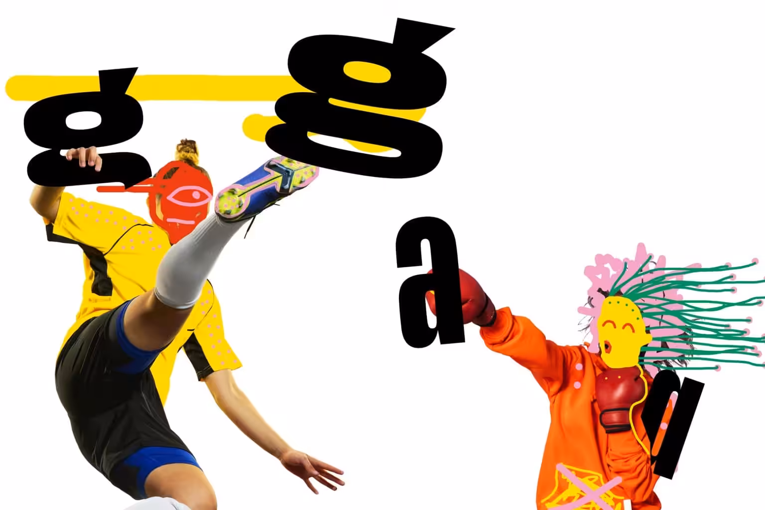
Designed by Christine Gertsch, Push leaves a lasting and self-assured impression in any setting. The design of Push echoes the letterforms of the first one hundred years of sans serifs yet carries its own weight in a very contemporary manner. Its bold condensed, crossbar-less capital ‘G’ takes inspiration from Thorowgood’s 1830 Seven-Line Grotesque, while the lowercase ‘a’ follows in the same vein as Plak from 1930.
Instead of sweeping through the family in a massive interpolation operation, Christine Gertsch began to work on the extreme widths of the bold weights in order to remain in full control of the curvature and to avoid too much compromise. The intentional change in curvature across Push’s widths and weights is a key feature of its anatomy. The extensive range from extra-condensed to extra-wide and from extra-light to extra-bold equips designers with an unparalleled typographic palette, offering huge versatility and variety ready to tackle any project.