Norganex
Depot
23.11.25

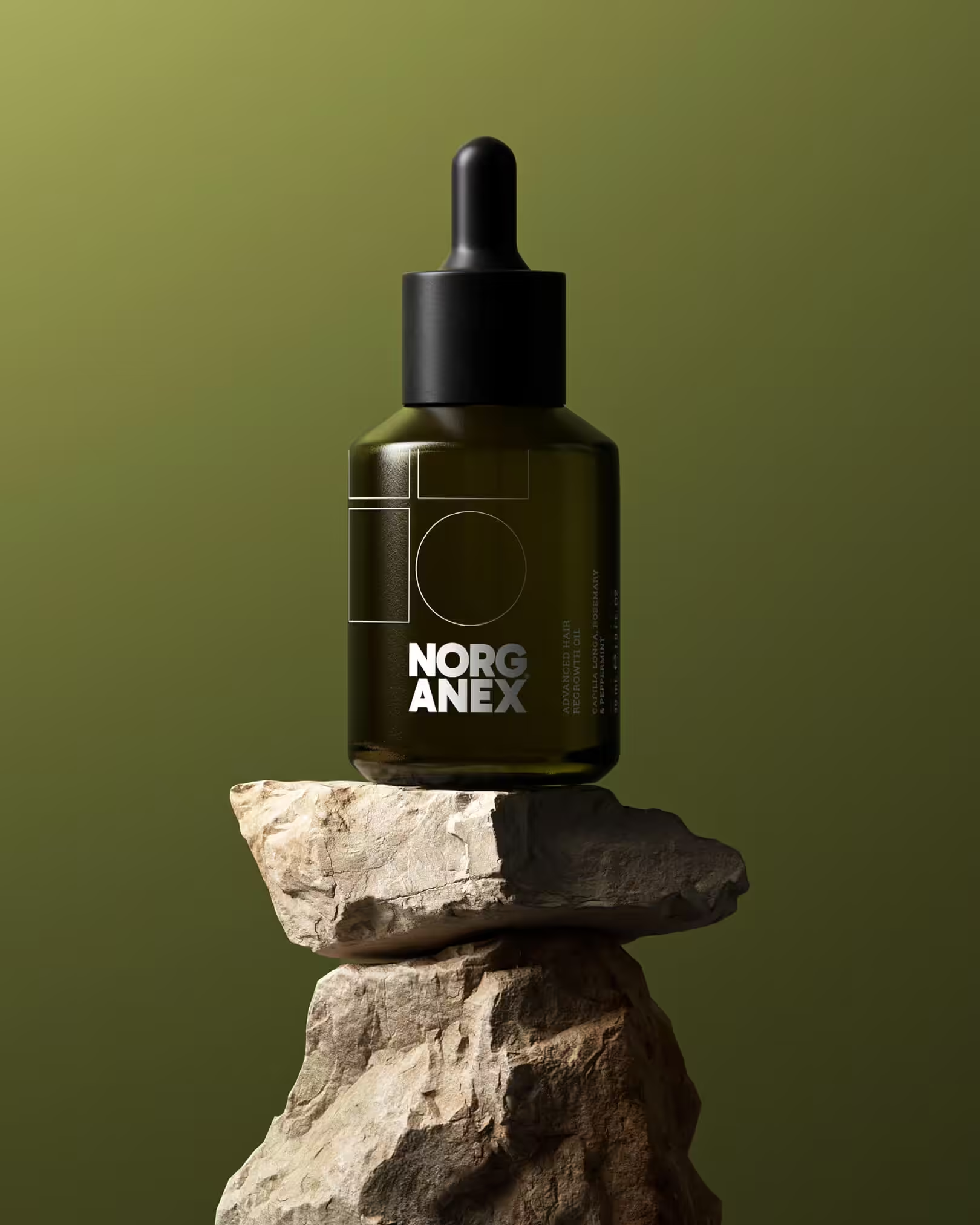
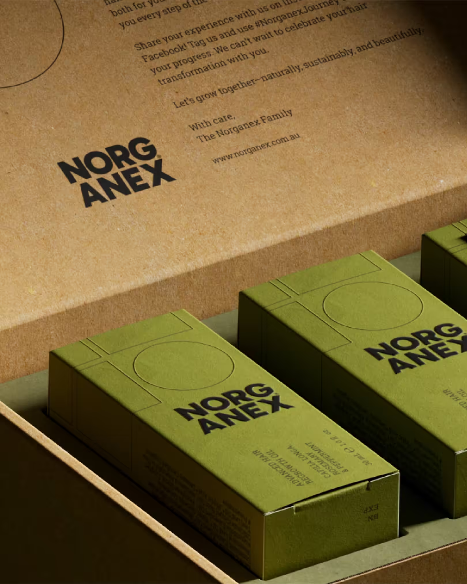
Depot saw that Norganex needed more than a new label it needed a system. The brand’s new identity and packaging design communicate clarity, credibility, and quiet confidence from first glance.
Informed by the rise of quiet luxury and performance-driven beauty, the design strips away excess in favour of intelligent simplicity. A modular grid where squares symbolise damage and circles signal repair anchors the identity in both science and elegance. Olive green, inspired by the oil’s organic origins, balances clinical precision with natural warmth.
Typography and finishes follow suit: modern, structured, and tactile, with blind embossing and spot UV gloss amplifying quality. The result is a brand built to perform minimal yet meaningful, technical yet human.