Now Often Always
Studio—Don
24.03.25

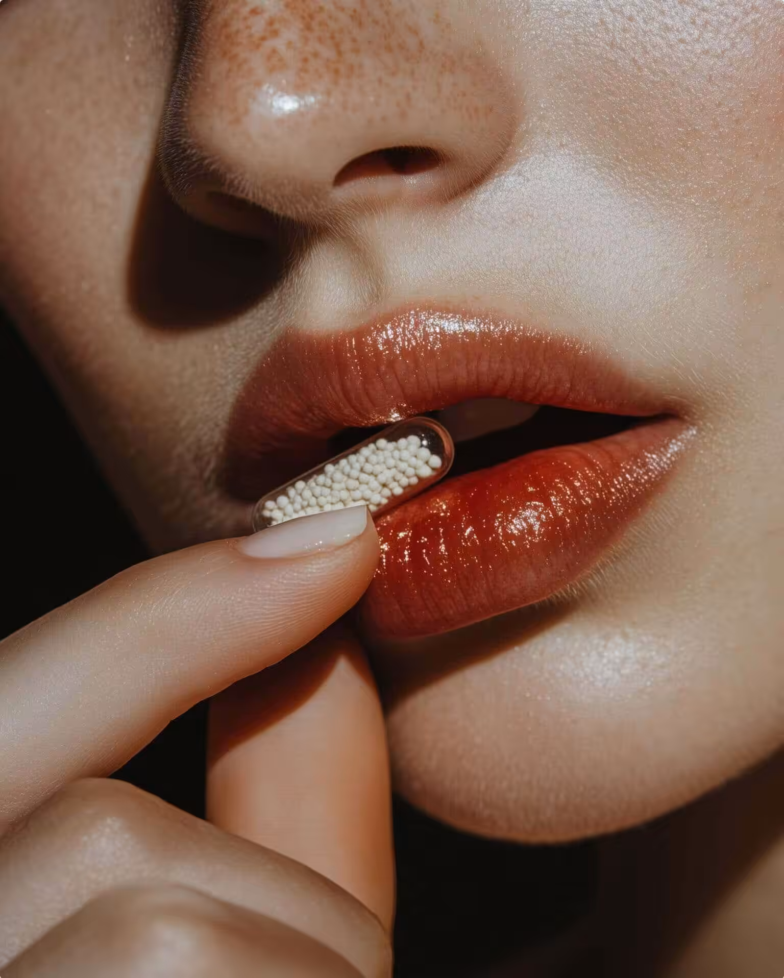
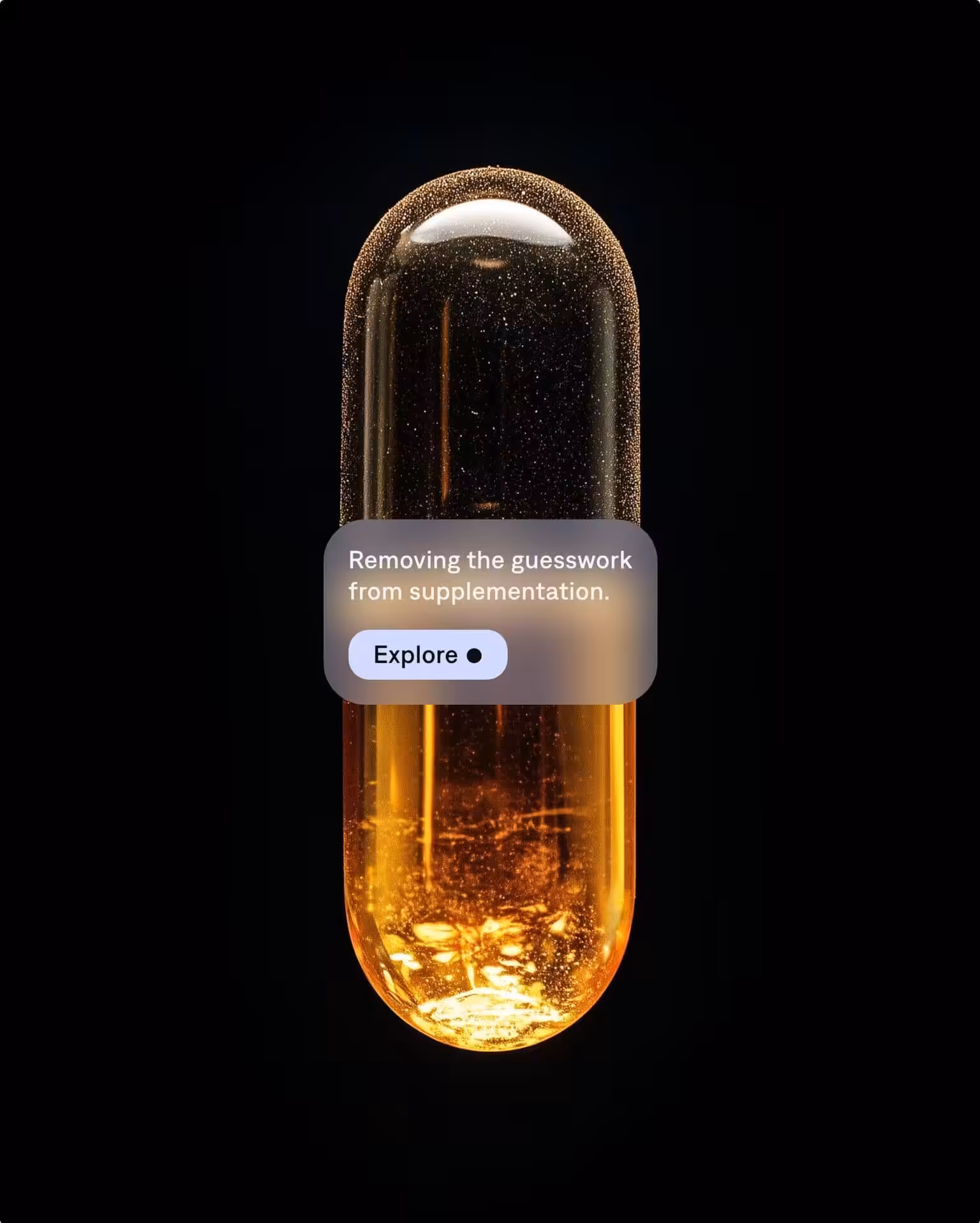
Now Often Always (NOA) transforms personalised health into a daily rhythm, not a destination. With science-backed supplements tailored to individual needs, NOA cuts through the noise of self-care, making wellness simple, strategic, and data-driven. At its heart, NOA is a female empowerment brand, equipping women with the knowledge and tools to take control of their well-being.
From inception, NOA was built with intention—from strategy to naming to visual identity. The name itself reflects the brand’s philosophy: health isn’t a one-time fix but a continuous practice. Inspired by the dots on an iPhone calendar—one for now, two for often, three for always — NOA’s wordmark transforms a familiar symbol into a representation of ongoing self-care.
The brand’s design balances precision with warmth. A minimal colour palette and refined typography establish credibility, while soft, human elements ensure approachability. NOA is not just about supplements—it’s about redefining wellness as an accessible, empowering practice.