POC Energy
Sunny at Sea
10.03.26

POC Energy offers intuitive EV chargers designed for the Nordic climate — simple, no-fuss solutions that perform reliably in all conditions. The brief for the brand identity was equally straightforward: reflect that same simplicity within the brand itself. Rather than adding layers, Sunny at Sea’s approach focused on removing them. There is no graphic logo or unnecessary embellishment. The brand name is typeset in its core typeface, bold, clear, and functional, ready to work seamlessly across applications, from charging stations to presentations.
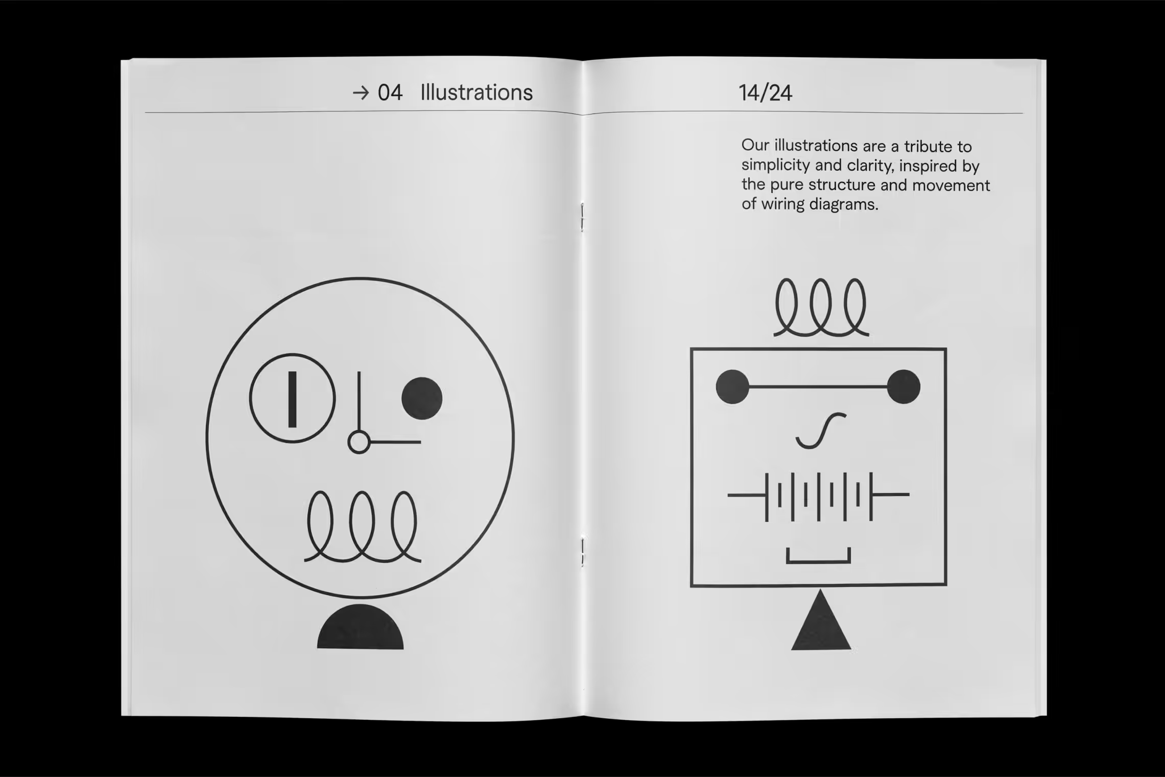
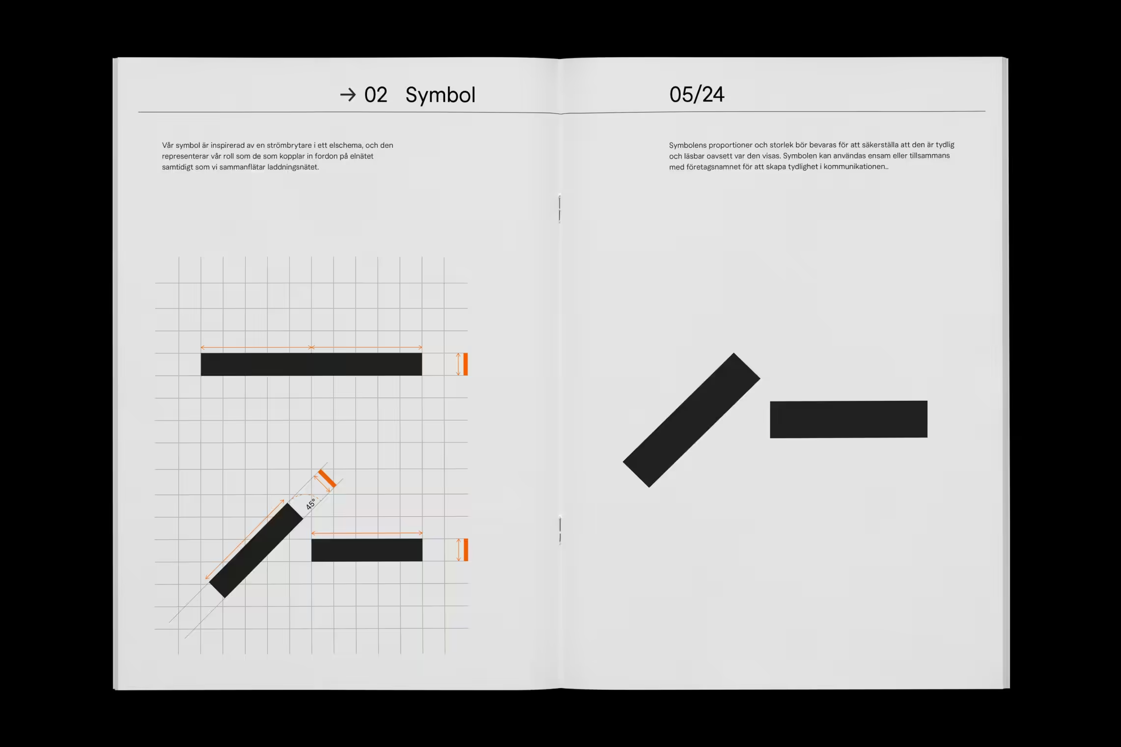
The symbol follows the same distilled principle: a diagonal line intersecting a horizontal one. Inspired by the universal “power on” icon found in electrical diagrams, it subtly references both the brand’s function and its name — Point Of Charge. In motion, the symbol transforms into a switch, visually expressing access to energy. Every element of the identity adheres to this logic. Iconography and illustrations are derived directly from circuit diagrams — instantly recognizable and reduced to their essential forms. The result is a minimal, scalable system designed for consistent use across all touchpoints. It speaks directly to POC Energy’s core audience of electricians and professionals who value intelligent, effective solutions over design for its own sake.