WUKA
Studio NARI
15.10.25
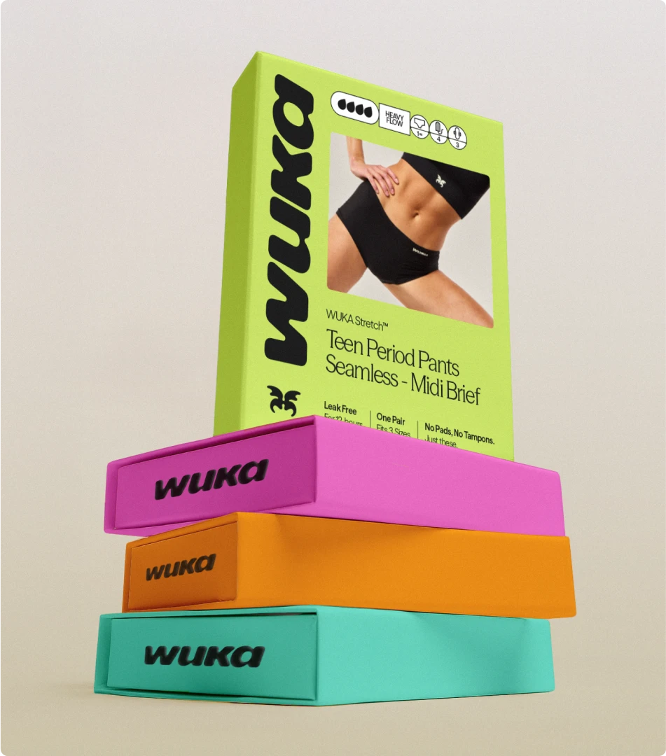
WUKA enlisted Studio NARI to reimagine a bold, human-forward brand identity rooted in purpose. As a leader in women’s health, they set out to normalise period care, empower tweens and teens, and spark community. Their brief: move away from tired category clichés and reconnect with a voice that feels confident, caring, and transformative.
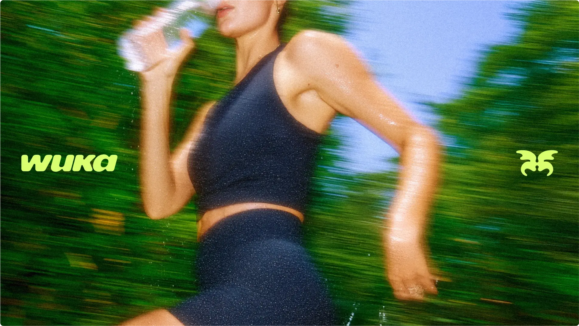
Central to our strategy was the idea of Force of Nature more than just a creative concept, it became the beating heart of the brand. We translated it into a visual language marrying softness with energy, organic curves with a sporty edge, and a tone we titled Big Sis, which speaks directly, kindly, and with respect.
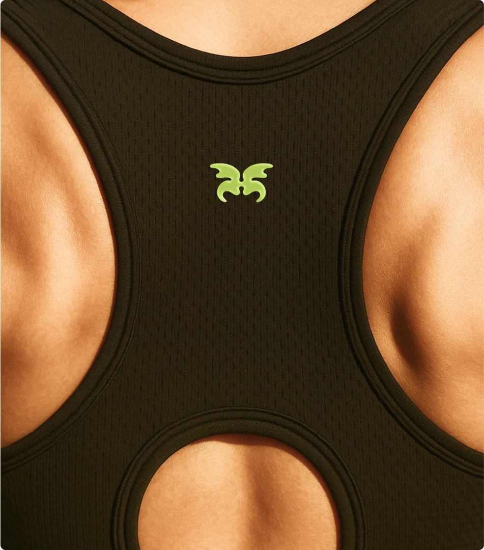
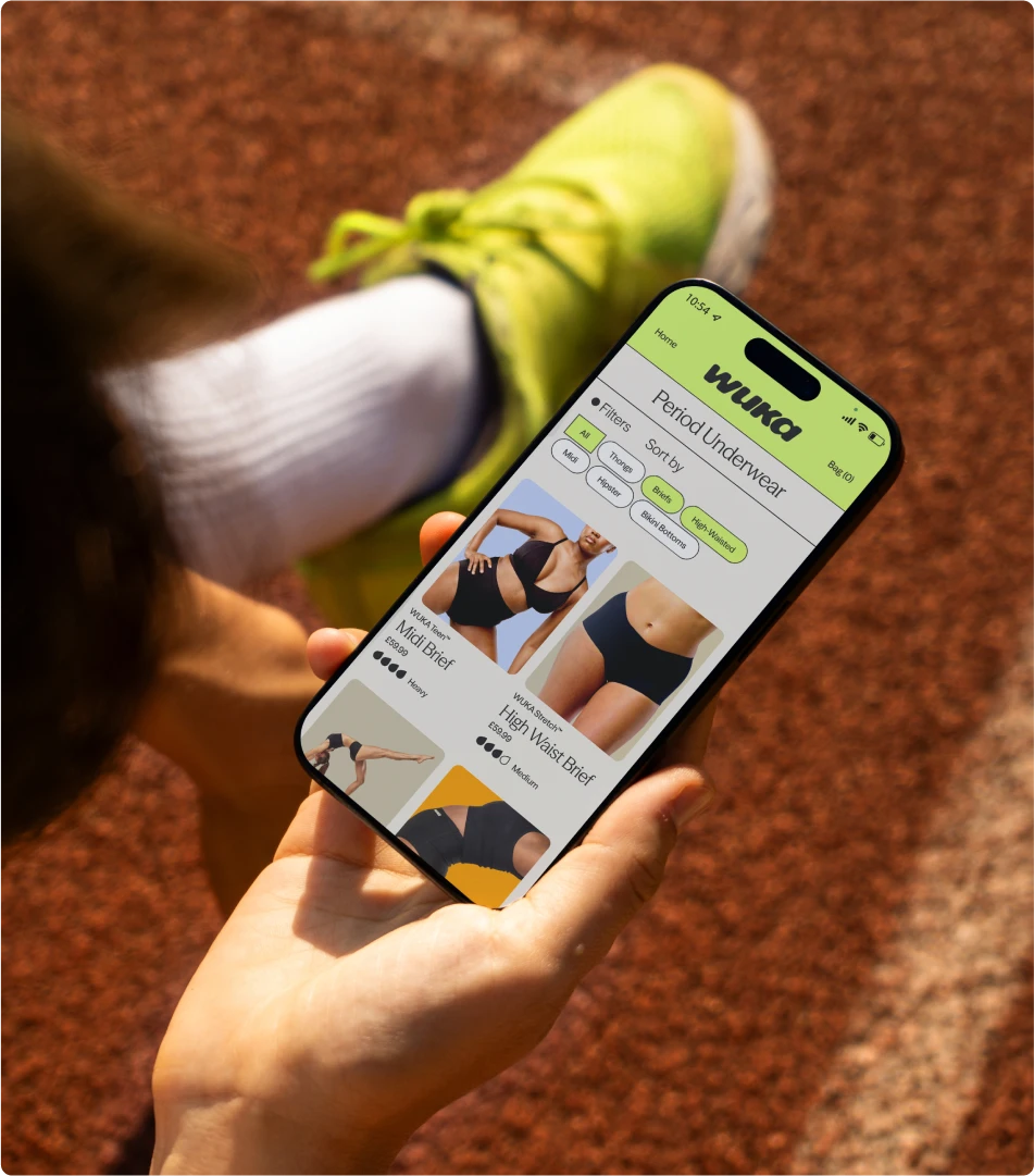
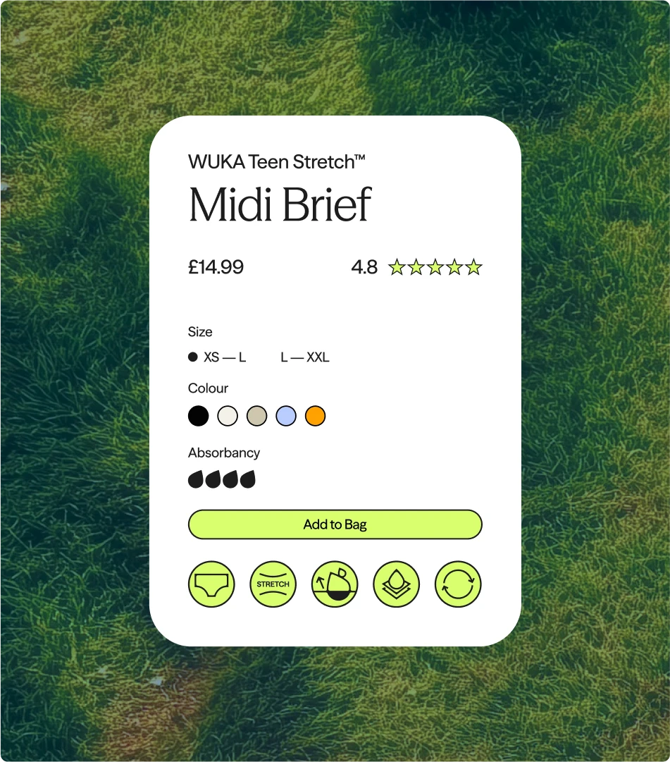
The new logotype balances strength and fluidity; the Lunafly marque symbolises renewal and growth. Dynamic layouts and motion bring flexibility to messaging. In sum, WUKA now stands as an energetic, community-led brand that empowers a generation to see menstruation as a force, not a constraint.